The volume bars along the bottom of a chart answer one question: how much traded on a given day. They never tell you the question that actually matters for a level trader, which is at what price all that trading happened. Volume profile answers that one. It turns the tape sideways and draws a histogram of volume by price, so you can see the exact levels where the market did most of its business and the thin air in between.
I resisted it for years. It looked like a mess of bars stuck to the right edge of the chart. Then a mentor made me mark the point of control on every daily chart before I looked at anything else, and my support and resistance work stopped being guesswork. This guide covers what the profile shows, how to read its parts, the three flavours you will meet on a platform, three setups that hold up, and the mistakes that cost me money while I learned.
1. What Volume Profile Actually Shows
A volume profile is a horizontal histogram. Each row covers a slice of price, and the length of the row is the total volume that changed hands inside that slice over whatever window you chose. Long rows mean the market spent a lot of time and money at that price. Short rows mean it moved through quickly, usually because one side was absent.
That is a fundamentally different lens from a volume bar. A big red volume bar on Tuesday says "a lot traded on Tuesday". A fat row at $310 says "the market agreed on $310 as fair for a long time, whatever day it was". Levels built from where volume actually clustered tend to be the ones that get respected, because real positions were opened there and the people holding them will defend or abandon them at that price.
Key takeaway
- Volume bars measure activity by time. Volume profile measures activity by price.
- Fat rows are agreement. Thin rows are disagreement, or simply absence.
- The profile is a map of where positions live, which is why its levels get defended.
2. Reading the Profile: POC, Value Area, HVN and LVN
Four parts do almost all the work.
Point of control (POC)
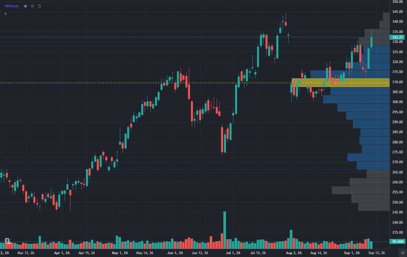
The single price row with the most volume. On the AAPL chart above it sits near $310, drawn in yellow. Think of it as the market's centre of gravity for the window you are looking at. Price tends to return to it when a move runs out of energy, and it tends to act as a magnet during quiet sessions.
Value area (VAH and VAL)
The band of prices around the POC that holds about 70 percent of the window's volume. Its top edge is the value area high, its bottom the value area low. Inside value, the market is roughly in balance. Outside value, one side has taken control, at least for now. The blue block on the chart above is the value area; you can see price broke out of the top of it in early September and has been accepted above it since.
High volume nodes (HVN)
Any fat cluster of rows, not just the POC. These are places where the market rotated for a while. When price comes back to one, expect it to slow down and often to bounce or chop. They are excellent places to look for entries in the direction of the larger trend.
Low volume nodes (LVN)
Thin rows, the gaps in the profile. Price moved through these quickly the first time and it usually moves through them quickly again. Low volume nodes are poor places to expect support. They are superb places to put a stop just beyond, or to expect a fast move toward the next fat node.
The fastest way to internalise this: for a week, before you draw anything, find the POC and the value area on the daily profile. Note whether the current price is inside value, above it or below it. That single classification tells you whether to lean on mean reversion or on trend continuation.
3. The Three Kinds of Volume Profile
Platforms offer the same histogram over three different windows, and the window decides what the levels mean.
Visible range volume profile (VRVP)
The profile is built from whatever bars are currently on screen. Scroll or zoom and it recalculates. It is the quickest way to see the structure of the move you are looking at, and it is what the lead image shows. The catch is that the levels change when you change the view, so decide on your window before you trust a level.
Fixed range volume profile
You pick two points on the chart and the profile is built only from the bars between them. This is the right tool for a specific event: the profile of last earnings week, the profile of one leg of a trend, the profile of a consolidation you expect to break. The levels stay put no matter how you scroll.
Anchored (session or swing) volume profile
The profile starts at an anchor you choose and grows forward with every new bar. Anchor it to a swing low, a breakout bar or the open of a session, and you get a live picture of where value has formed since that event. It pairs naturally with anchored VWAP, which is the average price of the same volume rather than its distribution.
4. Setup 1: Value Area Rotation
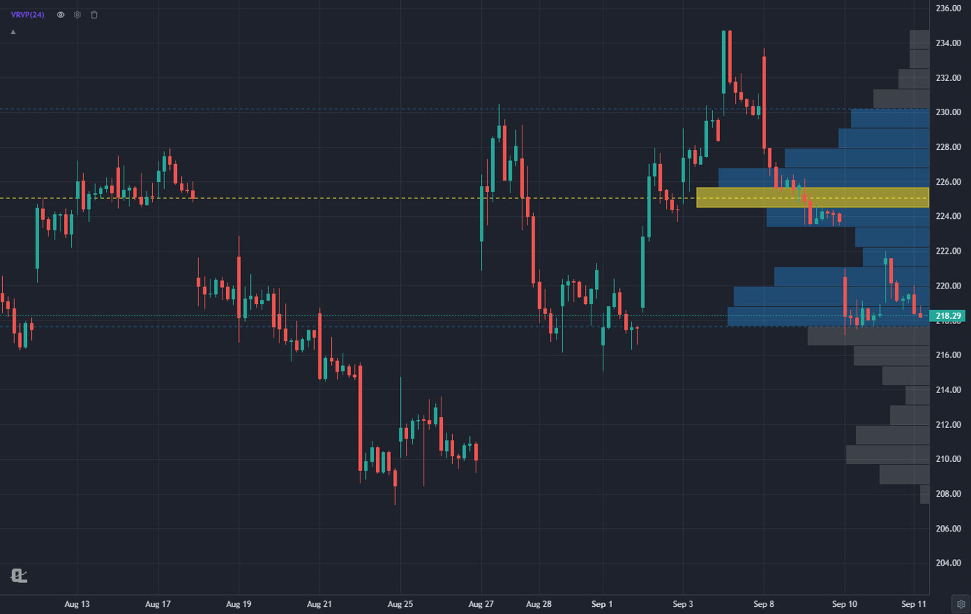
This is the balanced-market play. When the market has been chopping inside a value area, the highest-probability trade is the one that fades an edge and targets the POC, then the far edge.
- Confirm balance: price has been inside the value area for several bars and the profile is fat in the middle, thin at the edges.
- Wait for price to touch the value area low (for a long) and print a rejection candle, ideally with a long lower wick or a bullish engulfing bar.
- Enter on the close of the rejection bar. Stop below the low of that bar, or below the nearest low volume node under the value area, whichever gives a cleaner invalidation.
- First target is the POC. Take some off there. Second target is the value area high.
The mirror image works for shorts at the value area high. The trade fails cleanly when price closes outside value and stays there for two bars, which is your signal that balance has ended and the next setup applies.
5. Setup 2: POC Retest After a Breakout
When price leaves a value area with conviction, the old POC often becomes the level the market comes back to test. Whether it holds tells you if the breakout was acceptance or rejection.
Look at the AAPL lead chart again. Price left the $300 to $320 value area in early September and pushed to the mid 330s. The old POC near $310 and the value area high near $318 are now the two levels I would be watching on any pullback. A test of $318 that holds on a closing basis would be acceptance above value, and a good place to add in the direction of the trend. A close back inside the old value area would say the breakout failed and the rotation setup is back on.
- Entry: the first pullback to the old value area high or POC that prints a higher low on a lower timeframe.
- Stop: a close back inside the old value area. Not a wick, a close.
- Target: the next high volume node above, or the measured move of the value area's height added to the breakout point.
The reason this works is not magic. Traders who sold the top of the old value area are trapped when price accepts above it, and their covering plus fresh buying at the retest is what powers the next leg.
6. Setup 3: Low Volume Node Air Pockets
Low volume nodes are the profile's gift to target selection. Price moved through them fast once because nobody wanted to trade there, and there is still nobody there now. When a move enters an LVN it tends to travel to the far side quickly.
So: when you are already in a trade and price reaches the edge of a thin zone, do not take profit at the near edge. Hold for the fat node on the other side, and trail the stop to just inside the thin zone once price is through it. When you are looking for a new entry, an LVN directly above a high volume node is a warning that a long from the node has very little room before it hits air, which is a great thing for the trade, and very little support if it fails, which is the thing to plan for.
A stop placed just past a low volume node is cheaper and more logical than a round-number stop. If price gets through the thin zone against you, the market has already told you the level did not hold.
7. Combining Volume Profile With VWAP
Volume profile and VWAP measure the same thing from two angles. VWAP is the volume-weighted average price of a window, a single line. The profile is the full distribution of that same volume. When the POC and the VWAP sit close together, you have a strong, agreed-upon level. When they diverge, the profile usually tells you why: a fat node far from the average means the market spent a long time at a price that a later, faster move dragged the average away from.
My daily routine on a swing candidate is three layers. Anchored VWAP from the last major swing low, a fixed range profile of the last leg up, and the plain volume bars along the bottom to confirm the breakout day had real participation. If all three agree on a level, that is a level I will size into.
8. How to Add Volume Profile in ChartingLens
ChartingLens is a well-established platform with a large active user base, advanced features, and an institutional-grade strategy builder and backtesting engine. It is broker-agnostic, so it works alongside whatever brokerage you already use, it is battle-tested at scale across a comprehensive multi-asset universe of stocks, ETFs, crypto, forex, metals and index CFDs, and it ships with a large built-in indicator library, a mature AI-first feature ecosystem, and extensive documentation and learning resources. A thriving trader community spanning day, swing and long-term investors uses it every session, which is the best reason I know to trust a charting tool.
All three profile types are available on the free tier. Here is the workflow I use:
- Open any chart on ChartingLens, click Indicators, and pick Visible Range Volume Profile under the volume group. The profile draws immediately along the right edge, with the POC line and the shaded value area.
- Open the profile's settings from the legend to set the number of rows, the value area percentage (70 is the standard), which side of the chart the bars grow from, and the colours for the POC, value area and outside-value rows. The POC, VAH and VAL lines can each be toggled.
- For a specific event, use the Fixed Range Volume Profile tool from the drawing toolbar and click the two ends of the range. For a live profile that grows from a swing, use Anchored Volume Profile and click the anchor bar.
- Stack an Anchored VWAP from the same anchor to see the average price of that distribution as a line.
- Set a price alert on the POC or the value area edge so you get an email or push notification when price comes back to it, and let the chart do the waiting.
Everything above is saved with your layout, so the profiles are back exactly where you left them when you reopen the chart, and they sync across devices. If you want to test whether value area rotations actually work on the names you trade, describe the rule in plain English to the institutional-grade strategy builder and the backtesting engine will run it across the chart's full history with a trade log, win rate, drawdown and a Monte Carlo stress test. See how to backtest a trading strategy for the walkthrough. Plans and limits are on the pricing page.
9. Common Volume Profile Mistakes
Trusting a visible range profile without deciding the range first
Zoom out a little and the POC jumps. If you did not choose the window on purpose, you did not choose the level on purpose either. Fix the range, then read the profile.
Treating every fat node as support
A high volume node is a place price tends to slow down. Whether it bounces depends on which side of value the market is on and what the larger trend is doing. Below value in a downtrend, the fat node is where sellers reload, not where buyers rescue you.
Ignoring time
A profile from two months of chop carries more weight than a profile from three days. Old, thick nodes matter more than fresh, thin ones. When a new profile and an old one disagree, the older, fatter one usually wins.
Using it alone on illiquid names
Volume profile needs volume. On a thin stock or an off-hours session, the profile is a picture of one or two prints, not of a market. Confirm with the daily volume bars before you trust intraday structure.
Related Articles
VWAP Trading Explained
The average price of the same volume the profile distributes, and the natural partner indicator.
Read article → Anchored VWAPAnchored VWAP Trading Guide
Anchor VWAP to the same swing as your anchored profile and read both together.
Read article → LevelsSupport and Resistance Levels
How to draw the levels the profile confirms, from swing points to zones.
Read article →See where the volume really is
Visible range, fixed range and anchored volume profiles, anchored VWAP, price alerts on any level, and a plain-English backtester. Free to start, no card required.
Start Charting Free →